Product Card Revamp
Description
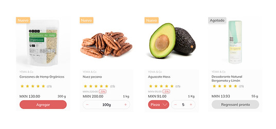
We've revamped the product cards to enhance the shopping experience and provide a concise display of key product information.
Role
End-to-end product design, design systems.
Designed for
YEMA & Co, all rights reserved.
About YEMA & Co
YEMA is consolidating as the first conscious supermarket in Mexico, where healthy eating is also delicious, and personal care has a clean and honest label.
%201_01_50%E2%80%AFa_m_.png)
Design Process
Used Design Thinking methodology to create this redesign.
%2012_49_35%E2%80%AFa_m_.png)
Phase 1: Emphatize
Take into consideration our user personas:
-
What do they want? Name, price, discount, reviews, format, etc.
-
What do they expect? Clear and easy way to see the main info of the product
-
What are their pain points? Difficulty to read, difficulty seeing the stock outs, difficulty to add to cart when using in mobile, etc.

Phase 2: Define
The problem:
Users are having problems reading the product's title, knowing which products are stock out, identifying discounts. Also, the look and feel did not correspond to the brand.
Benchmark:
Visited product pages of different sites in their desktop and mobile versions. Gather information on which is the main data and composition of the page.

Phase 3: Ideate
Information Architecture
Main information:
-
Product's Name
-
Product's Brand
-
Price
-
Discount
-
Size
-
Reviews
-
Photo
Secondary information:
-
Type of product

Phase 4: Prototype
-
Packaged Products: Products that are sold by package (cookies, milk, shampoo, etc.).
-
Bulk Products: Products that are sold by weight: nuts, gummies, almonds, etc.
-
Weight/ Piece Products: Products that are sold by weight or pieces: apples, avocados, etc.
-
Stock out Products: Items that are currently unavailable.

Phase 5: Test
Gather feedback from users by conducting usability tests with the prototypes. Iterate on the designs based on the feedback received.
.jpg)

